Assignment 2 - Redesign a Notable Information Graphic
Written on October 26th, 2025 by Wan-Ting Chang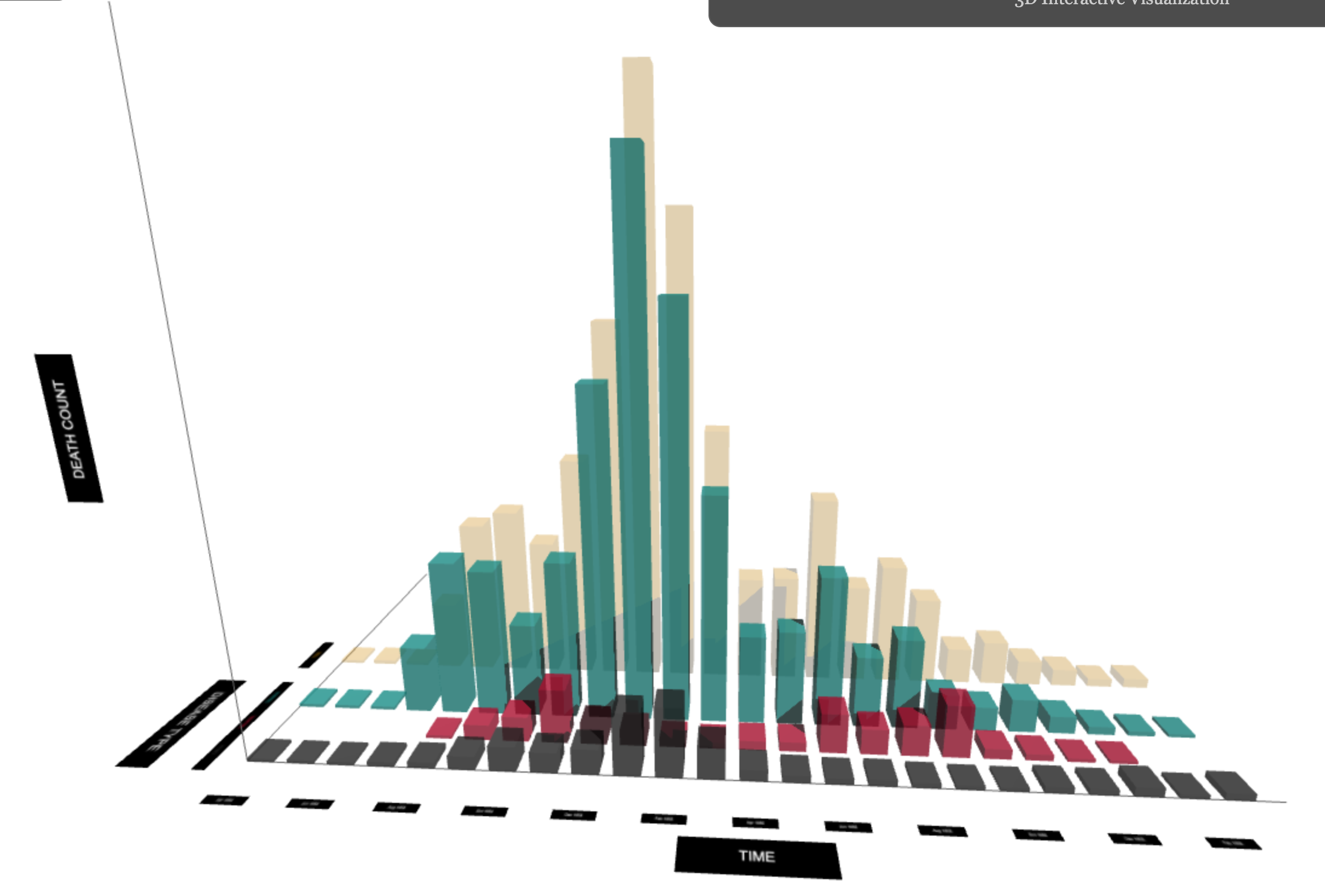
Introduction
For this assignment, we were given 3 notable information graphics and asked to redesign one of them using contemporary interactive methods. These graphics are Snow’s cholera map, Minard’s Russian campaign and Nightingale’s coxcomb. I chose Florence Nightingale’s coxcomb diagram because it’s quite confusing for me, actually. As a visual person, I can see numerous opportunities for improvement. Here is my analysis of the improvements for this diagram:
Problem 1: Pie Chart Confusion
It looks a lot like a pie chart to me, which has been less favored among the data visualization community due to lack of clarity for comparison of each data in each pie.
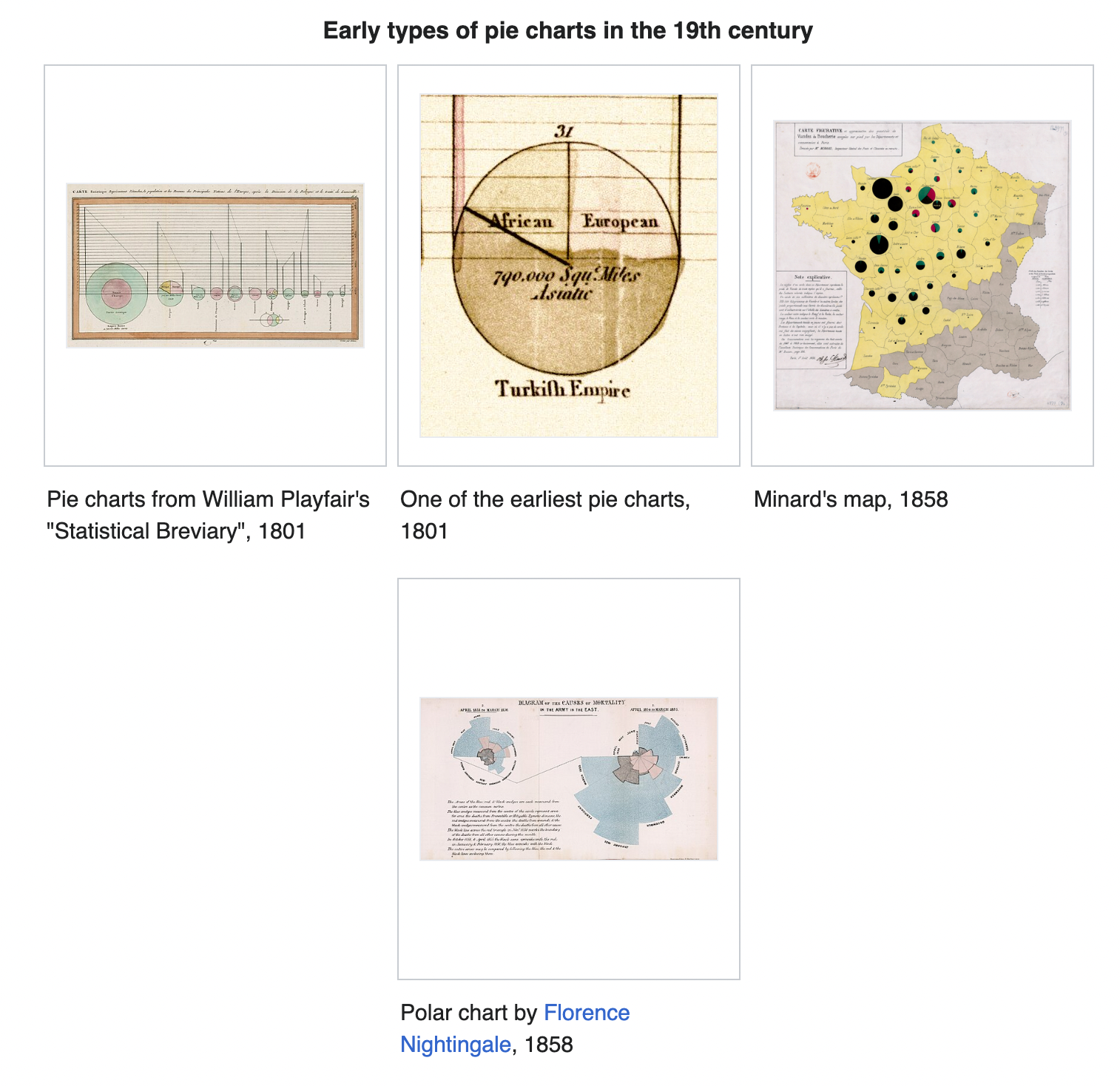
Screenshot from: https://en.wikipedia.org/wiki/Pie_chart
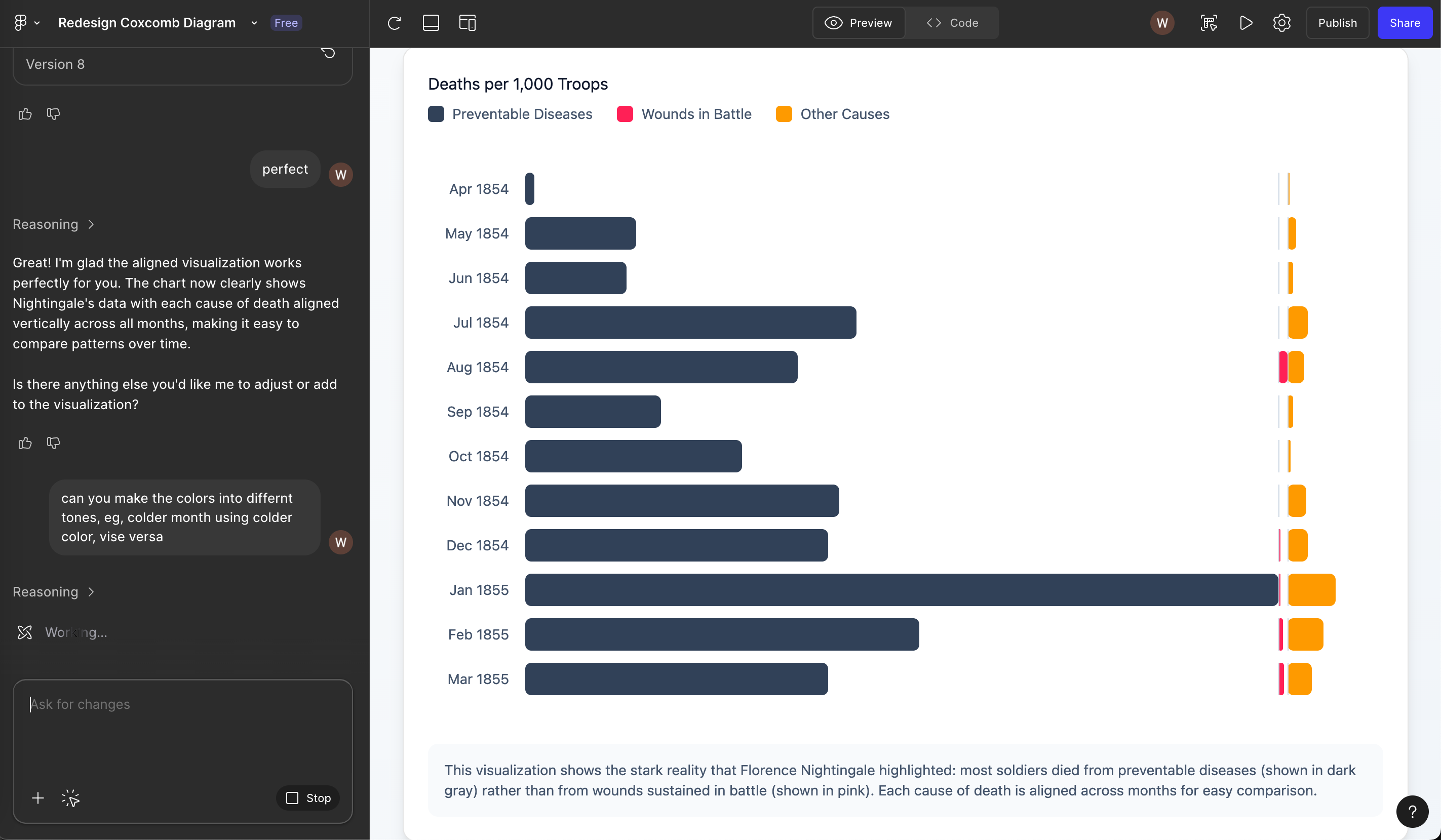
Problem 2: Inconsistent Sizes
The two years are in different sizes, it’s hard to tell which month has the higher death count.
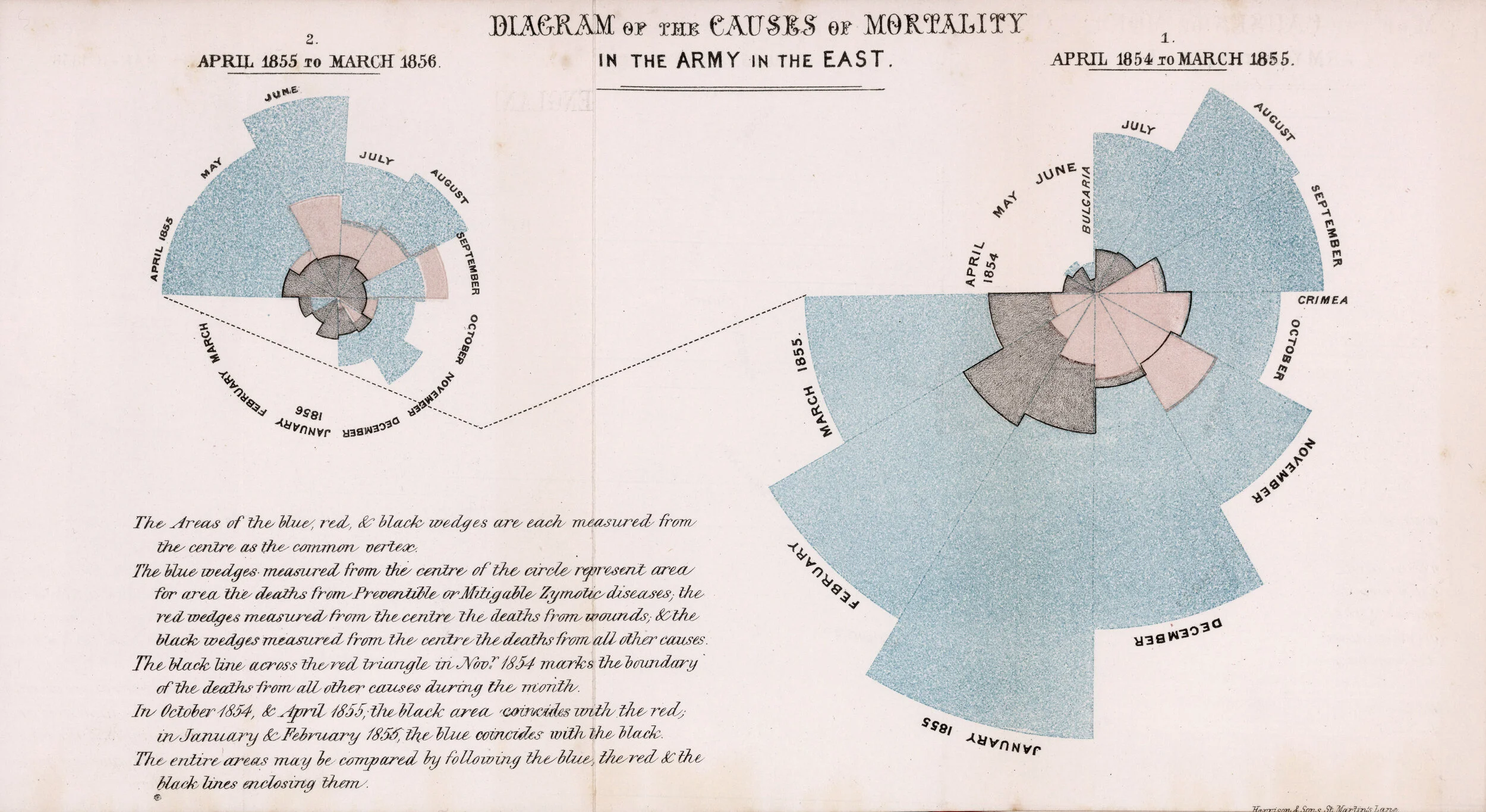
Issue: Year 1854 and 1855 are visualized at different scales, making temporal comparisons difficult and potentially misleading.
Problem 3: Overlapping Area Confusion
It is unclear whether the colored segments in Nightingale’s diagram overlap with one another. According to descriptions, all areas are measured from the center, which would make it impossible to represent the total number of deaths for each month accurately. If the colors were instead drawn with an overlapping effect, the overall mortality for each month would be more clearly visualized. On the other hand, if the segments do not overlap, the total number of deaths becomes easier to interpret, but it can be challenging to distinguish the relative proportions of each cause of death within a given month.
Clarity Issue: The radial design makes it challenging to distinguish between different causes of death and understand proportional relationships.
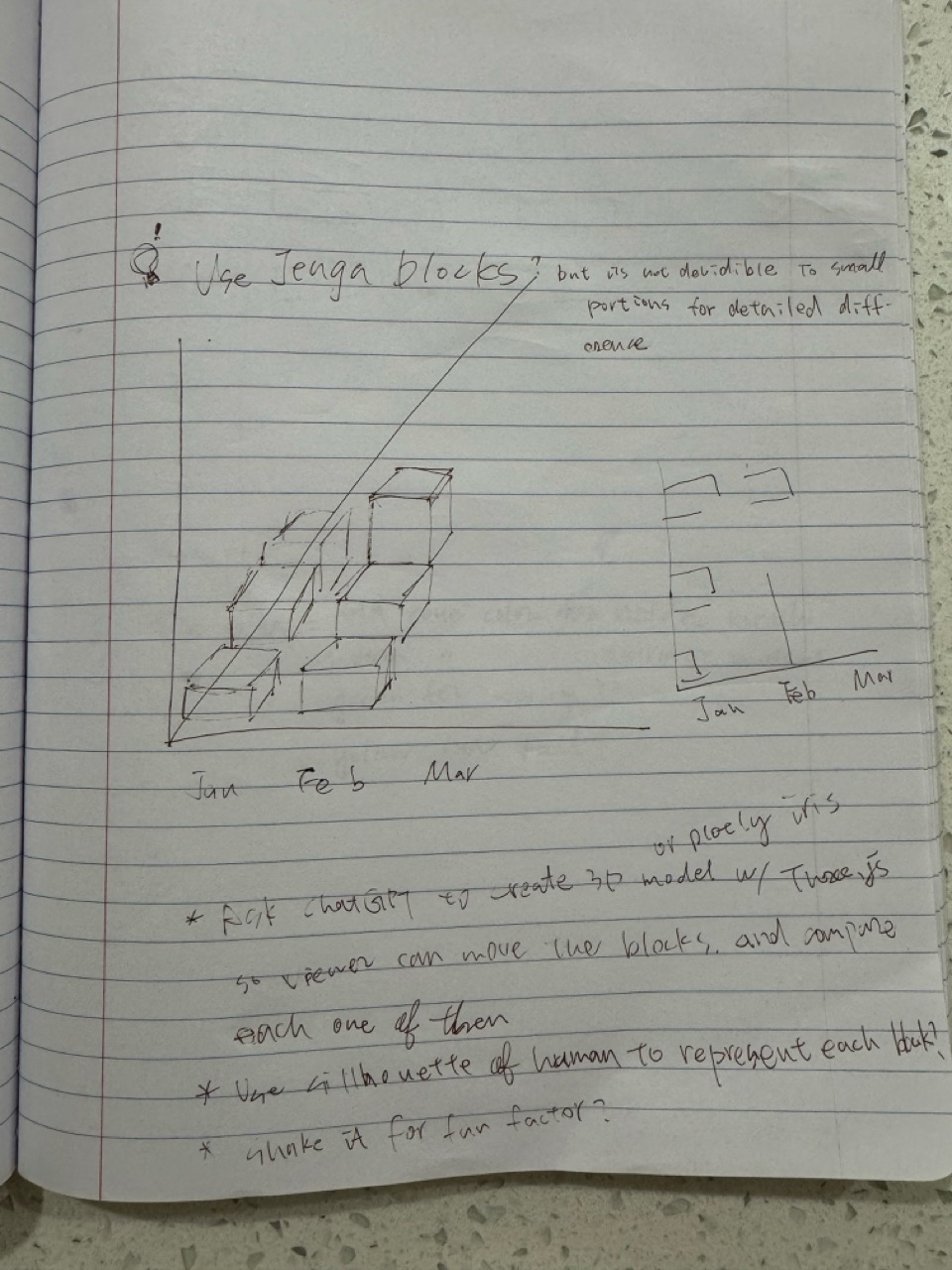
Initial Ideas: Jenga Blocks
So I started to write down ideas in my notebook. At first, I was thinking to use Jenga blocks to recreate something similar to the coxcomb but maybe more like a sun burst chart. But then realized that Jenga blocks have their own limitations. For example, I couldn’t cut it to make it proportionally correspond to the data.
Enter Play-Doh
However, I still wanted to explore this idea. I went to Walmart to look for Jenga blocks, but I didn’t find any. Instead, I came across a shelf full of Play-Doh, which gave me a better idea — why not use Play-Doh? It’s more flexible and easier to divide into portions. I drew inspiration from Amy Cesal’s daily Play-Doh data visualizations, which showcase creative data storytelling using tactile materials.
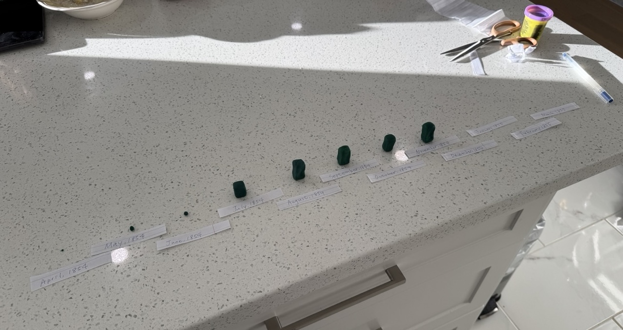
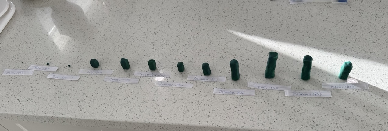
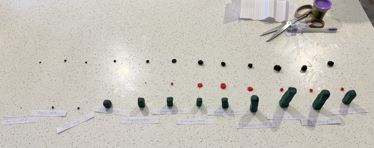
Innovation: Play-Doh offers the tactile, proportional visualization I was seeking while being more adaptable than solid blocks.
Pros: Tangible, easy to manipulate, easy to divide into portions, easy to play with, can stack them up to see the total number of deaths, and easy to explain to others, especially children.
Cons: Not sustainable, not reusable, time consuming and labor intensive to make it, not very efficient.
Exploring Digital Alternatives
I jot down more ideas.
Maybe a 3D bar chart
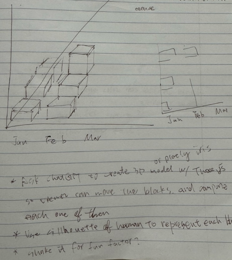
Or a 2D Calendar-like Bar Chart
I got some inspiration from Giorgia Lupi’s long covid visualization.
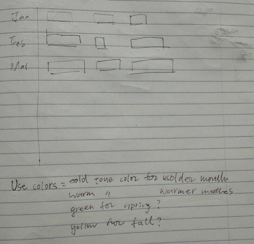
Contemporary Tools
I started to use contemporary tools to explore and develop the final two ideas.
I used Figma to create the calendar type chart
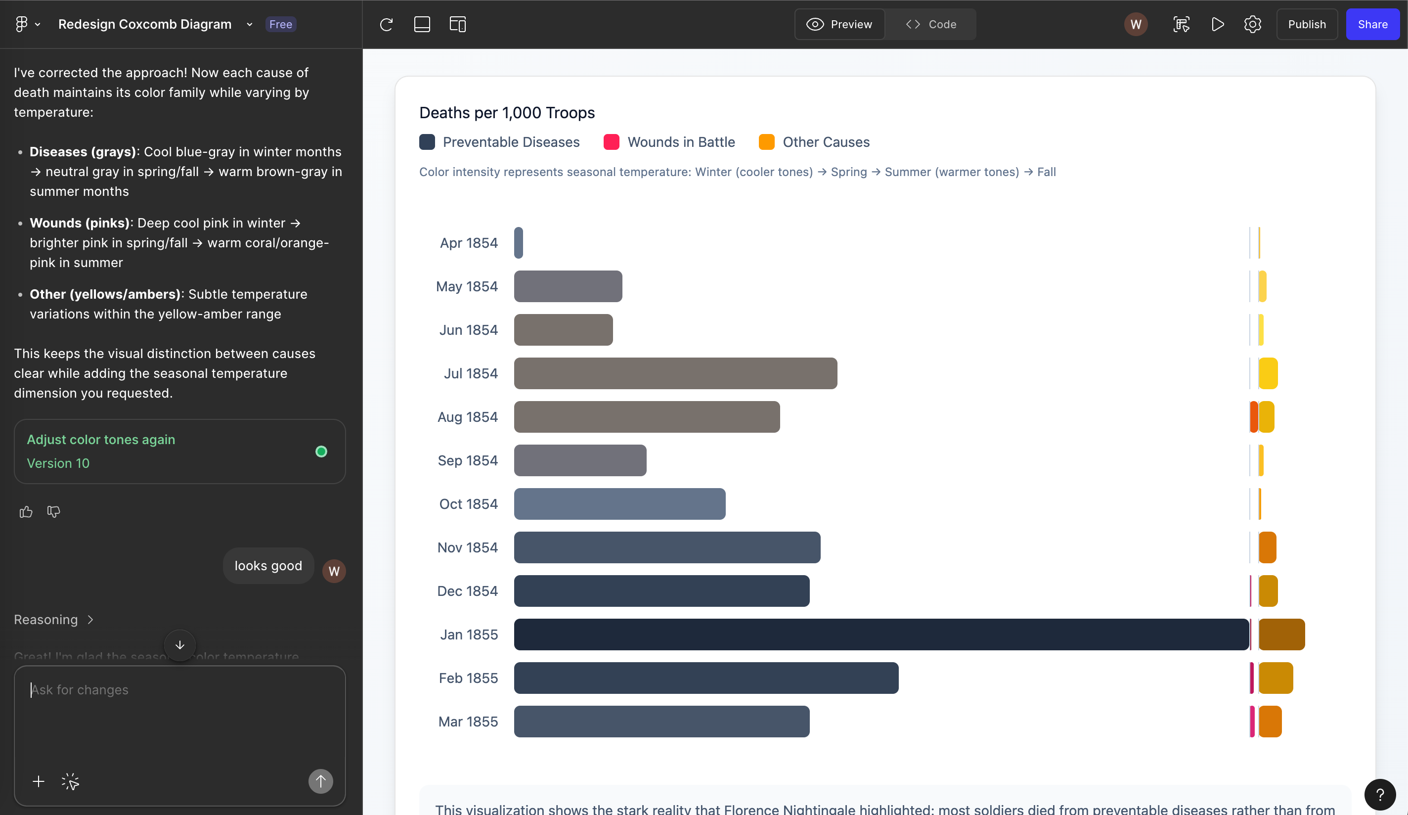
Color Temperature Visualization
Change the color tones based on the month’s warmth or coldness
Then I asked Cursor to generate the 3D bar chart for me
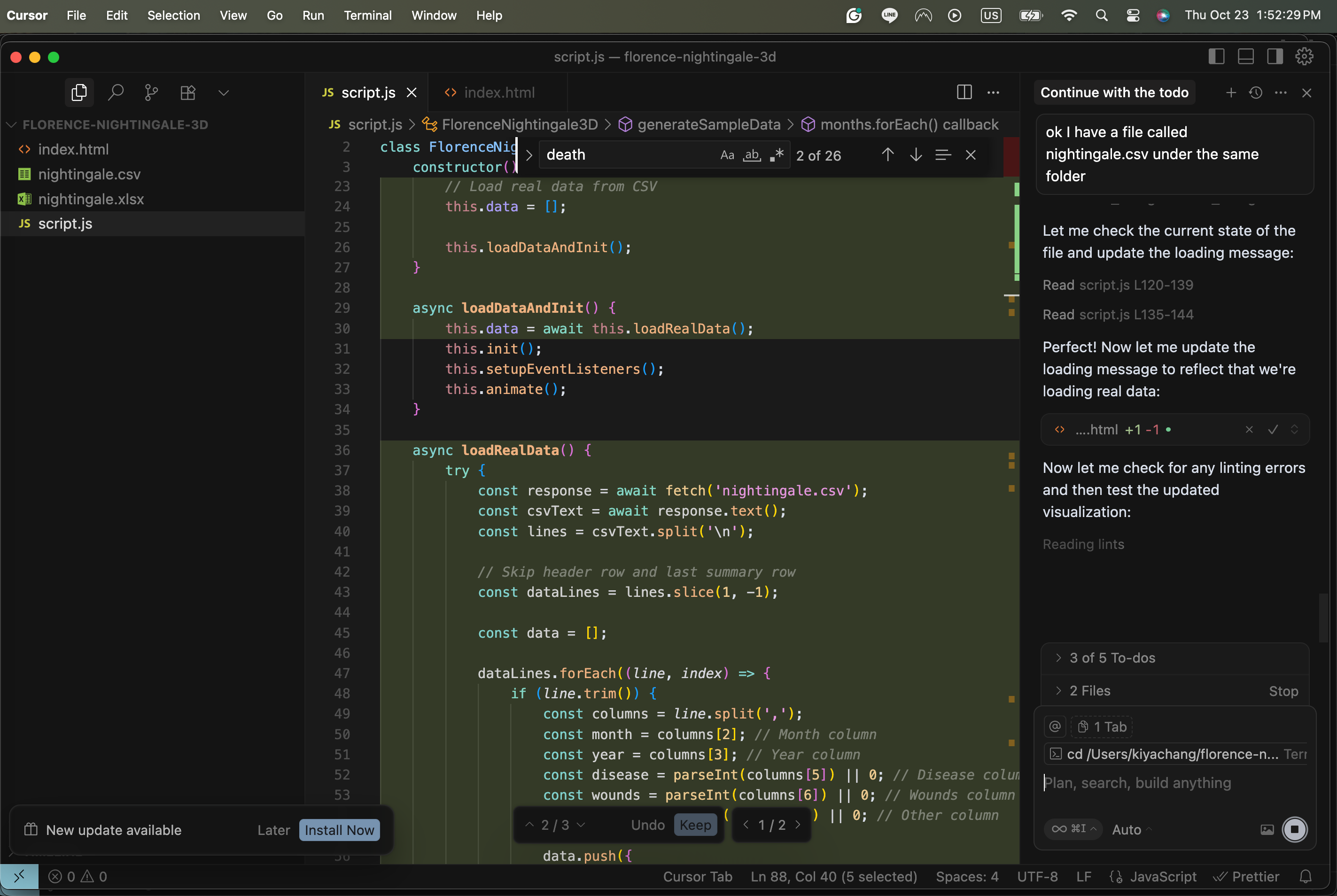
Technology: Using AI-powered code generation to create interactive 3D visualizations with Three.js
Final Decision
I think I like the 3D bar chart the best.
Because you can interact with it, hover to see the bar indicating the number of deaths. There is even a total death bar that you can see the significance of how disease plays an important role in it.
From the screenshot above, we can clearly see that the total death has a very high correlation with the disease death. This is a powerful insight that makes the visualization more persuasive. It tells the government that this is preventable - the soldiers are not dying because of the war, they are dying because of the diseases, so please send in sanitizing team to help them.